The Gatesman Site
The Gatesman Site
The Gatesman site undertook an overhaul in Spring of 2017. Our team had been seeing some cool trends and technologies that we were excited to use ourselves for some testing.
Getting Started
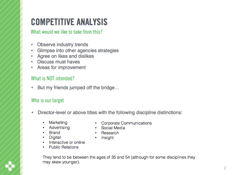
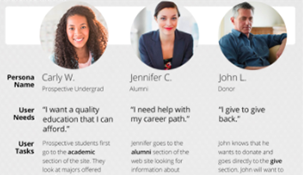
I worked as the UX Lead in tandem with Kelsey Pledger, Junior UX Designer. We defined our target audience. Most people who contacted us for work were Director level and above in Marketing, Branding, PR, or Corporate Communications.
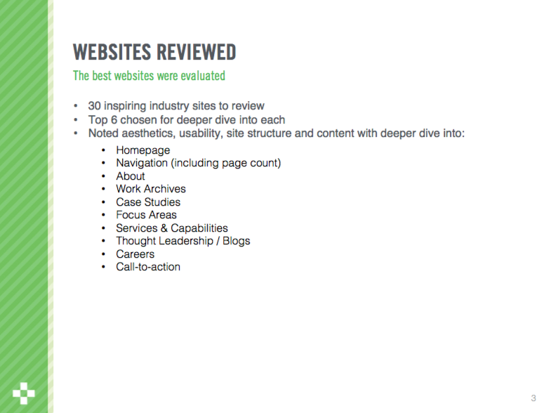
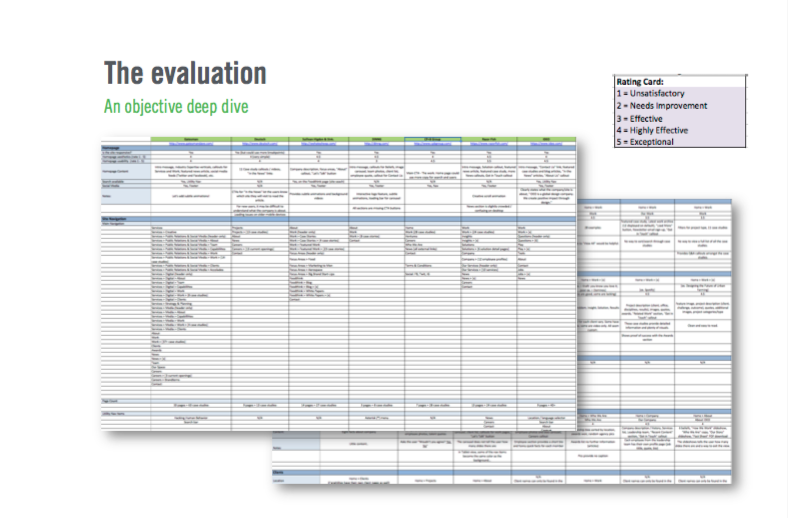
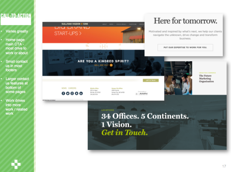
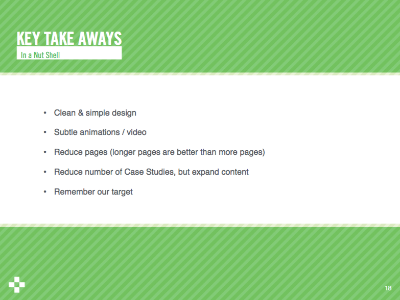
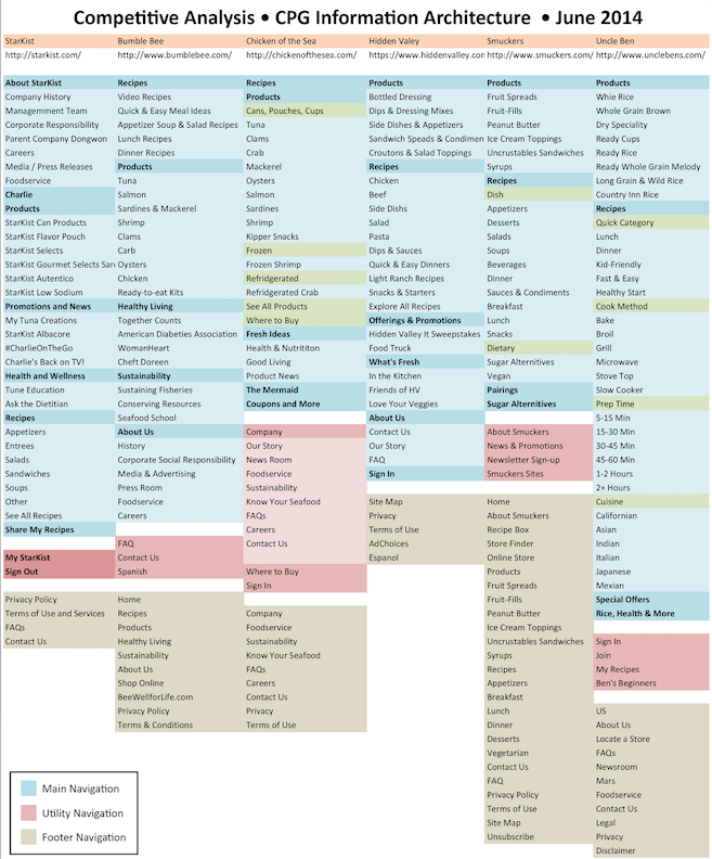
We took a deep dive with the users and did a competitive analysis on industry websites to gleam some more insight on the latest trends. A few of the largest recommendations were:
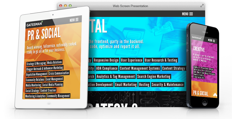
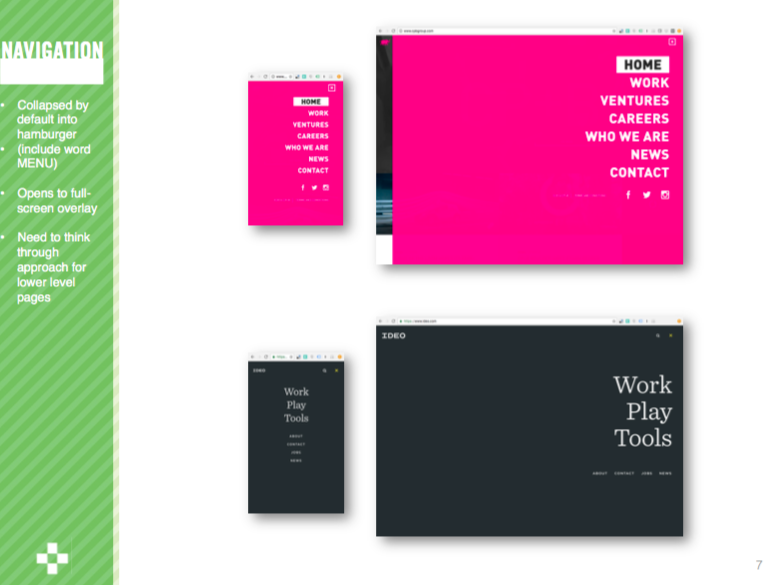
- Utilizing a new “always hamburger menu” allowed for more space and function.
- We included the word “Menu” based on user feedback.
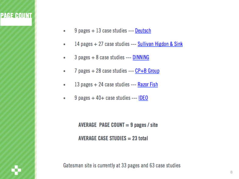
- Users were overwhelmed and reducing the number of pages & case studies could help narrow focus.
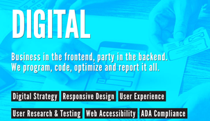
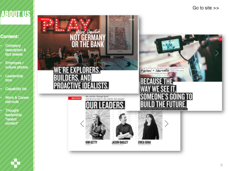
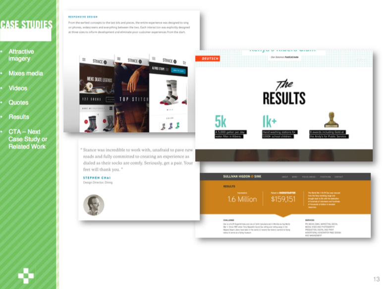
- Increase the quality of case study content to really tell the story of our work. Users wanted to know the process and that their is a real strategy behind our work.
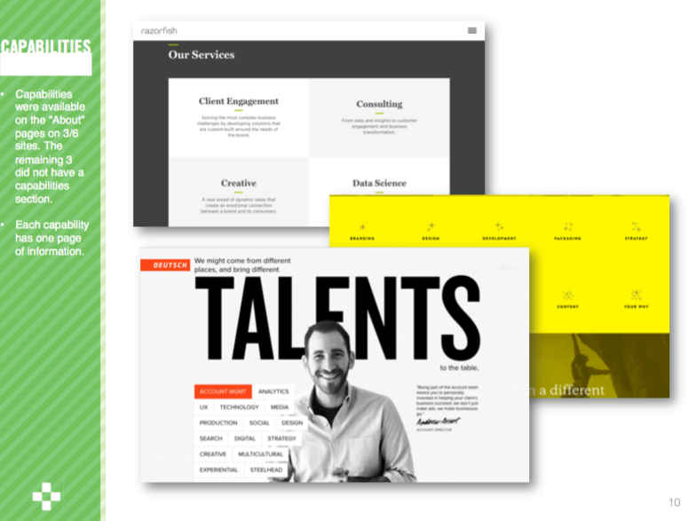
- Adjust language and talk like an industry leader. Example using terms like “expertise” over “capabilities”
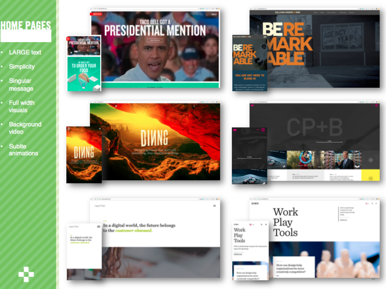
- Modern and Clean: Large fonts, background video, full screen scrolls
- Consistent, focused call-to-action across the site, contact us
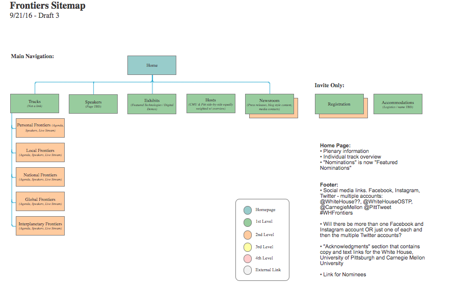
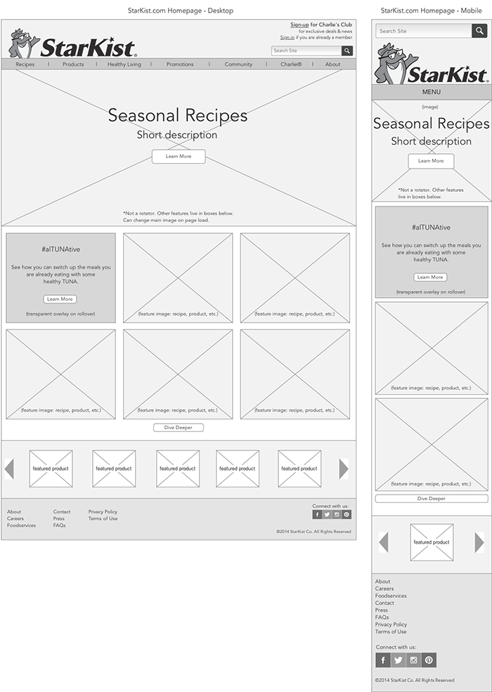
Interactive Wireframes
Since the layout of the site was drastically different from the previous layout, we decided to create interactive wireframes to communicate our ideas to the team. This included clickable links and a working navigation.
Designs
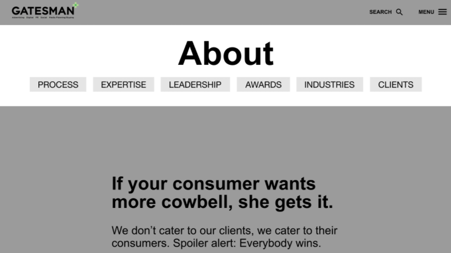
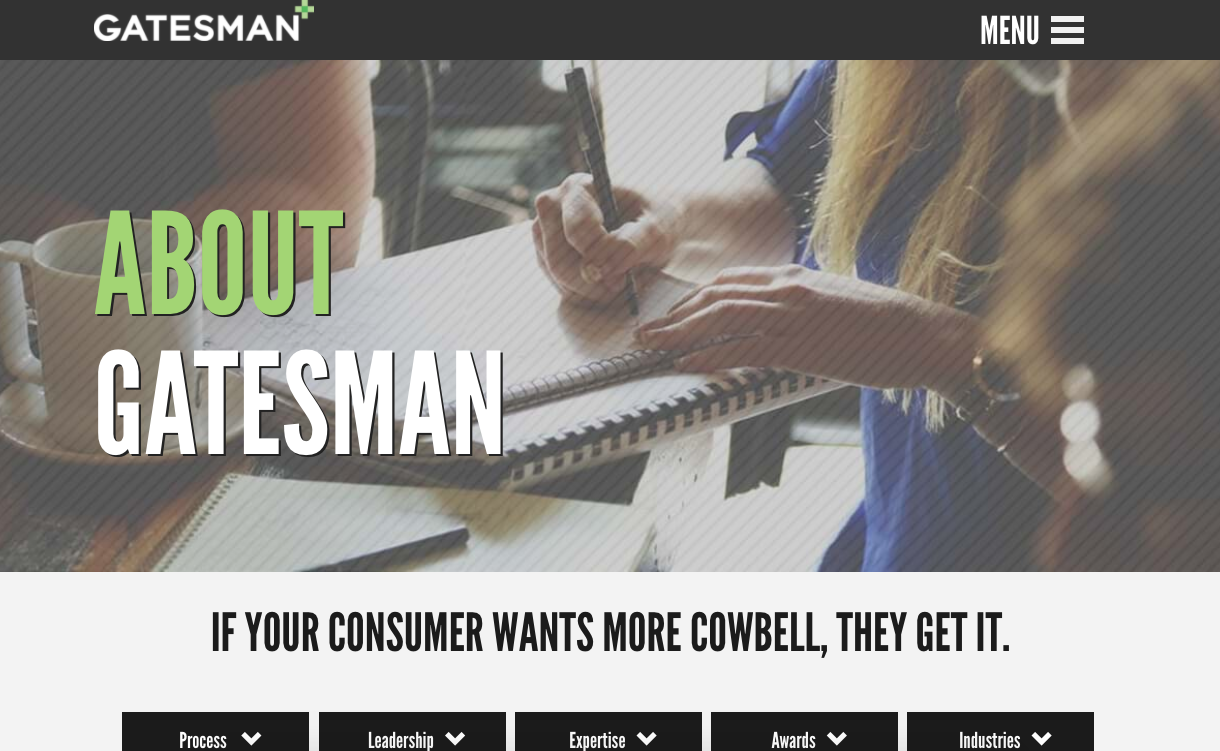
Working with Matt Axman, Creative Director at Gatesman, I created the interface design for a handful of pages on the site.

Be a Creeper