
by Erica Hayes | Jun 27, 2014 | blog, information architecture
Information Architecture Guidelines
A Quick Cheat Sheet
Over the past few months I have been working on an quick cheat sheet to give clients when we first start looking at their sitemap. The goal is to set some rules up front about naming and structure.
Here are my four fast rules for website IA in no particular order: trigger words, simplicity, proximity and priority.
Navigation Links & Site Structure Best Practices
Below are the first steps for creating easy to use navigation on your site:
- Users look for trigger words when trying to perform a task on a website. These words are short and to the point, or are used consistently across the internet or by your competitors. In regards to navigation, it is best to try to keep link titles as simple as possible for fast, easy recognition. Remove any repetition.
- Less is more. Decision paralysis occurs when the user is presented with too many options that they don’t understand. It is best to try to make a decision obvious. Try to limit main navigation options to 8 links or sections.
- Proximity is an important cue for the user. People have a tendency to recognize stronger relationships between objects that are located close to one another. Items that are like should be grouped together for fast and easy recognition.
- Priority is another important cue. Placing items in highly visible spots on a site, like the first and last items in a horizontal navigation bar, ensures the user will locate this item easily.
Do you like the fast four? Have something to add? Let me know, email me!
by Erica Hayes | Jan 18, 2014 | information architecture, portfolio, user experience, user interface, web site
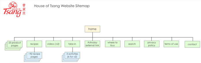
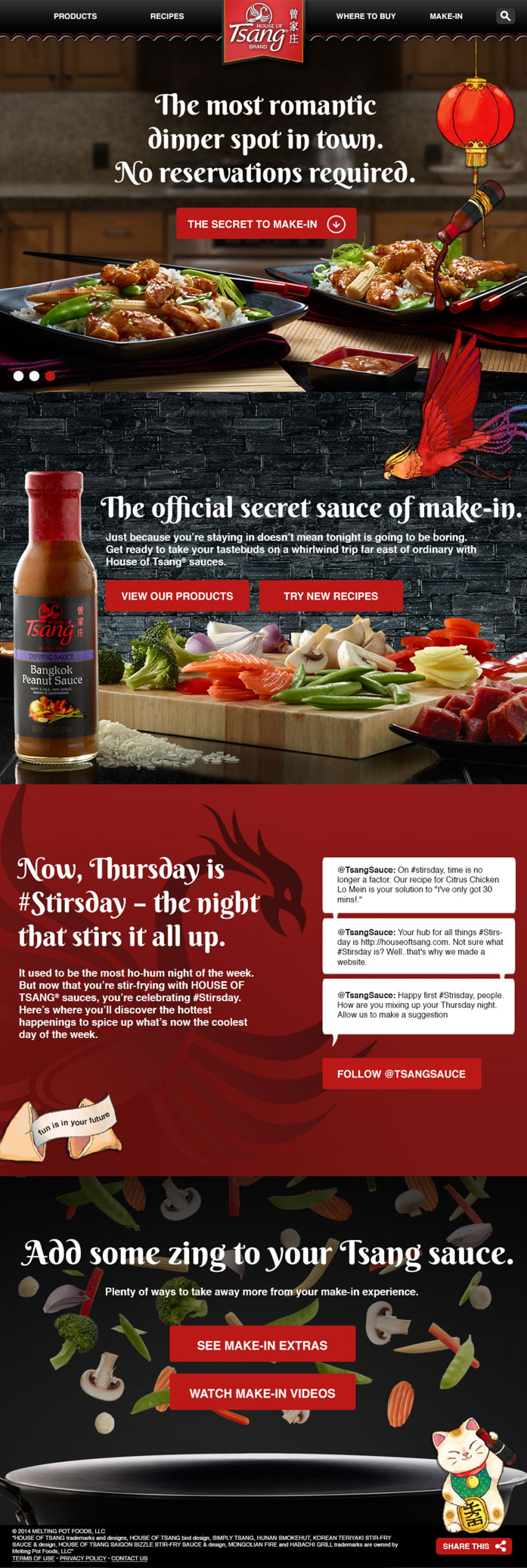
With Gatesman+Dave I had the opportunity to help create a web site for the Hormel food brand, House of Tsang®. I was responsible for the creating user experience & visual design along-side a team of developers and other creatives.
The responsive site had a very fast turn around and went from concept to completion in about 6 weeks.
*A very talented concept artist, Dani Kruse, is responsible for all of the pretty illustrations that you see.

by Erica Hayes | Jul 18, 2013 | information architecture, portfolio, user experience, user interface, web site
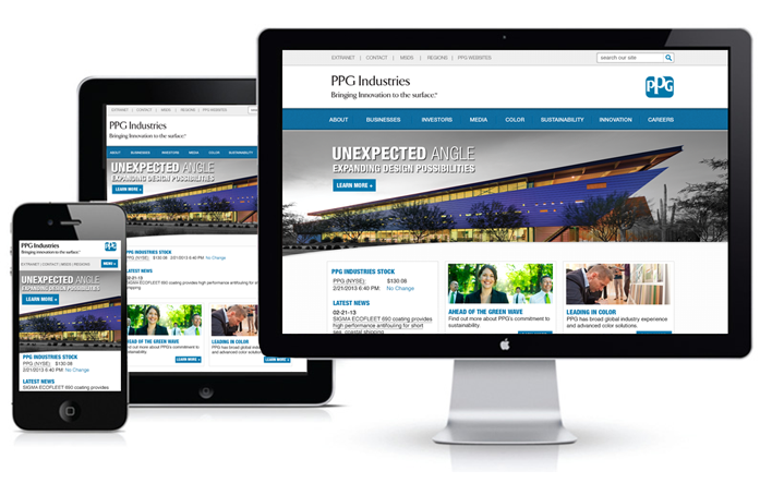
In 2013 I was responsible for the both the user experience and the user interface of the new PPG.com website redesign. I did extensive planning, conducted a detailed competitive analysis, created the information architecture, wireframes, and final design.
During the predesign phase of the PPG.com redesign conducted a content audit, took inventory of all the current pages on the site and created a sitemap for the future site. This allowed us to get the big picture of how many pages the site contained and easily reorganize the structure to better fit our users needs.
In the past, PPG’s business units were each allowed to create their own web identities. With the new design, corporate was asking that the businesses bring their main identities back into the structure. (This excludes customer marketing sites.) One of the larger challenges was making sure the businesses needs could all be met inside this master structure, and if there were still sites that diverted with their own navigation, how could we promote the “PPG hub.”

by Erica Hayes | Jun 18, 2012 | information architecture, portfolio, user experience, user interface, web site
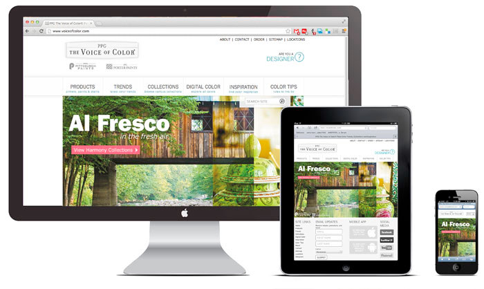
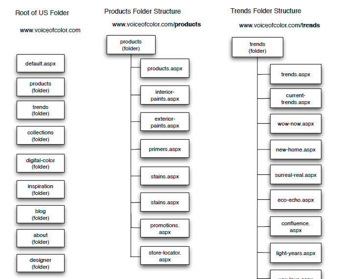
I worked on The Voice of Color Web Site redesign in 2011-2012 for PPG Industries. The site includes ~70 page with many dynamic features and is responsive. I drove the launch of VoiceofColor.com from concept to completion and worked with PPG marketing to fulfill their needs and requirements.
I was responsible for project management: managing task and deadlines between team members; information architecture: current content review, new site maps, calibration with copywriter; user experience: competitive reviews, wireframes, user flow; art direction: design and strategy; and development: calibration with off-shore developers.
by Erica Hayes | Mar 8, 2012 | mobile app, portfolio, user experience, user interface
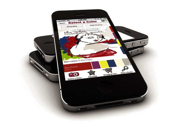
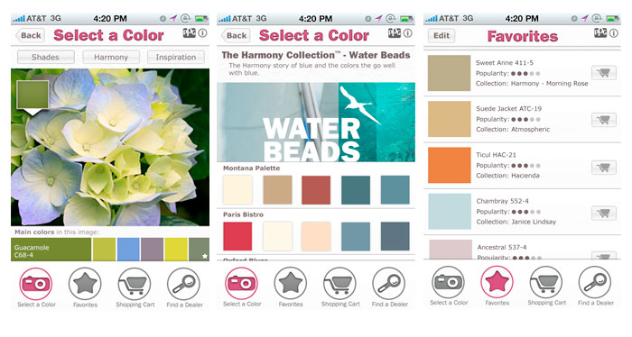
In 2012 I designed the Voice of Color mobile app for PPG Industries. I was responsible for the user interface design, information architecture, user experience and flow.
The app is available on both the iPhone and android operating systems and allows the user to grab color on the go and translate it into a PPG Pittsburgh Paints color.
Be a Creeper